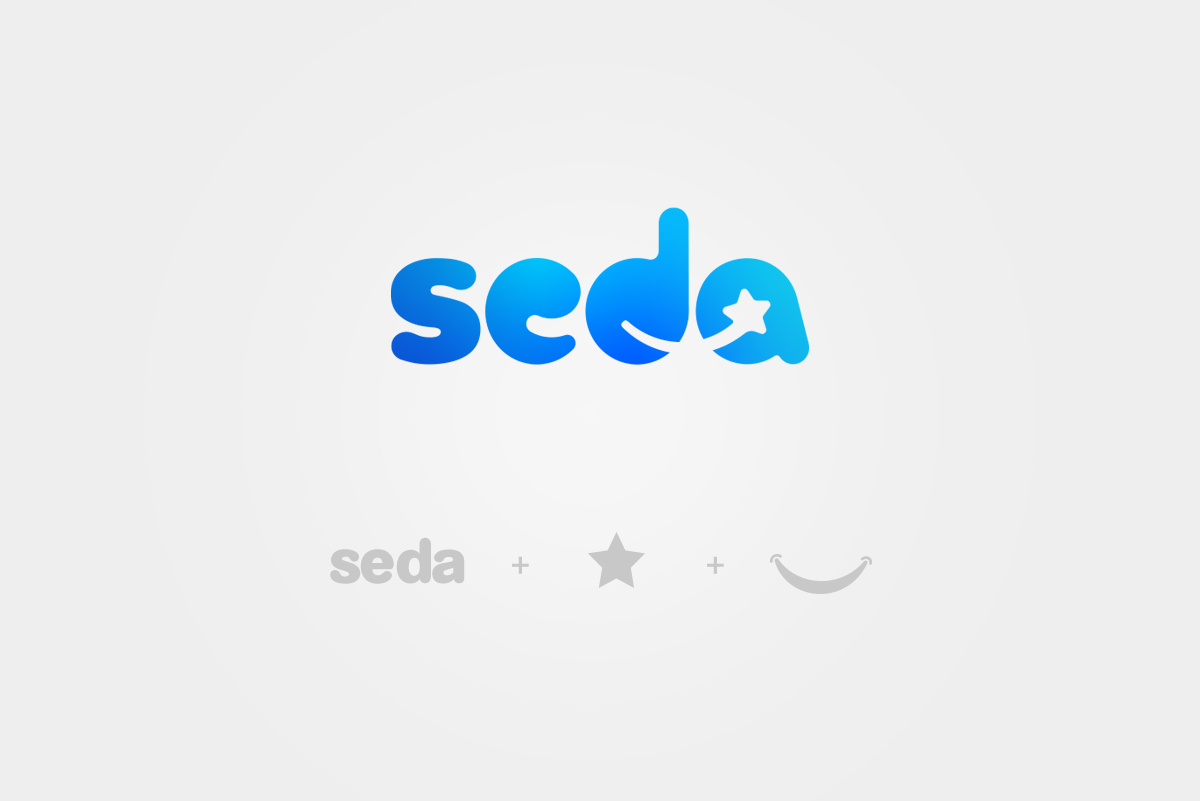
Design an updated modern logo identity that contains some of the same elements and characteristics of the current logo in a simplified way.
Objective
Execution
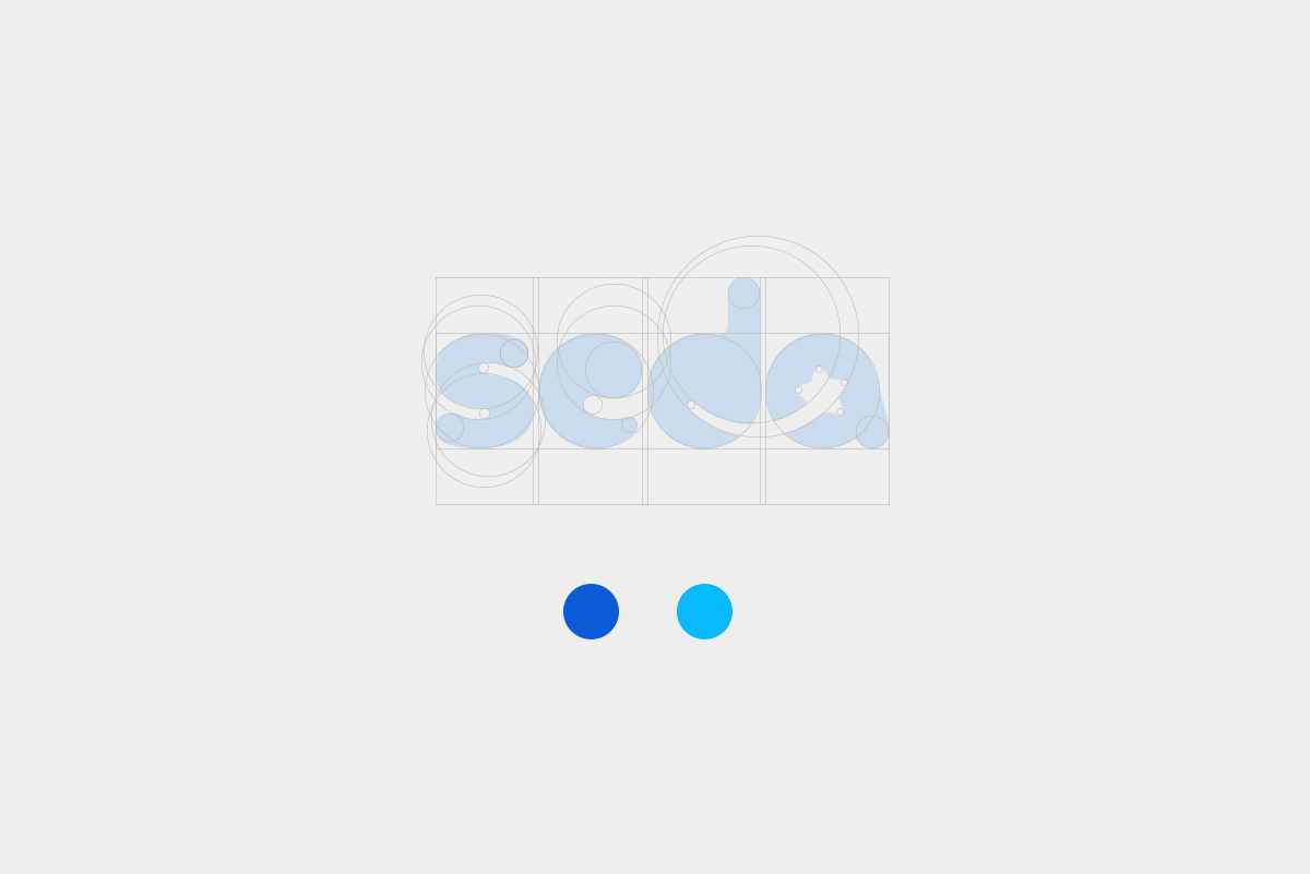
The re-design of SEDA Dental’s logotype takes the characteristics of the original logo and presents it in a simplified way. The use of negative space in the counter forms represents the transformation of your smile after visiting one of the seven Seda Dental locations. This new wordmark replaced the mismatched stroke weight of the letterforms and uppercase text treatment. Enhancing readability across all platforms is the reason we strayed from using any symbols. Using only lowercase letters the logo was created with a rounded, sans-serif typeface unique only to SEDA Dental. The color pallet was reduced and brightened to stand out. The new logo reflects Seda Dental’s clean, modern, and bright direction.


